Tuesday 15 September 2009

The impossible gnuplot graphs

This post is going to be a short one. I would only like to announce that most of the material presented here is collected in a more orderly fashion on my web page .


Comments should still be posted here.
Cheers!

Sunday 13 September 2009

The slice of the pie II.

Yesterday, I tried my hand at an exploded 3D pie chart. While we can use that method in particular cases, it is not "fool-proof": we might have to set the parameters by hand, should something cover something that it wasn't supposed to cover. Obviously, this situation is not ideal, even a bit disturbing, so I began to think what we could do differently.

The problem yesterday was that we used multiplot, and multiplot does not respect the depth ordering, i.e., we cannot let gnuplot determine the distance of the elements from the viewer, for it would miserably fail, simply because those elements are not parts of the same plot. Therefore, this whole affair could be much easier, if we were able to manage to put everything, or at least, the crucial pieces in one plot. Well, I have done the hard work, you have just got to read on to see the magic trick. I will start out with a particular example, but then I will show how this can be automated, so you just have to give the file name, and the rest will be done by the script. But, just to wet your appetite, here is the figure


Now, let us get down to business. We have six data points, which, for the sake of simplicity, are called
A=0.05*2*pi; B=0.3*2*pi; C=0.4*2*pi; D=0.1*2*pi; E=0.1*2*pi; FF=0.05*2*pi;

The last one is not really relevant, for the sum of these numbers is 2 pi(e), and FF is not used anywhere at all. If you recall, the reason for having to use multiplot was that when we put the pieces together, we changed the palette after each step, so the next piece, by default, had to be in a separate plot, and then we couldn't use depth ordering any more. Since we need different colours for the slices, the only way out of the loophole that I mentioned above is that we plot everything into a file, and then plot the file. When doing so, we need to specify the colour by a separate function, but that is really easy. After this introduction, let us see the script, which I will discuss further.
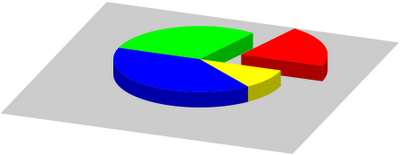
reset
b=0.5; a=0.5; r=1.0; s=0.1; m=1.5; eps=1e-4; N=6
A=0.05*2*pi; B=0.3*2*pi; C=0.4*2*pi; D=0.1*2*pi; E=0.1*2*pi; FF=0.05*2*pi

f(x,n) = (x>n?0.0:1.0)
F(x) = 1+f(x,A-eps)+f(x,A+B)+f(x,A+B+C)+f(x,A+B+C+D)+f(x,A+B+C+D+E)
at(y,x) = (x==0.0?0:(atan2(y,x)>0.0?F(atan2(y,x)):F(atan2(y,x)+2*pi)))

c(u,v,q)=cos(u)*r*v+q*cos(A/2); s(u,v,q)=sin(u)*r*v+q*sin(A/2)
C(u, q) = cos(u)*r+q*cos(A/2); S(u,q) = sin(u)*r+q*sin(A/2)
z = s+a; Z(v) = s+a*v

rg(x) = abs(cos(100*x/7))
gg(x) = abs(cos(100*x/11-pi/2))
bg(x) = abs(cos(100*x/13+pi/2))

set view 30, 20; set parametric
unset border; unset tics; unset key; unset colorbox; set ticslevel 0
set pm3d depthorder; set pal maxcolor N+1
set vr [0:1]; set xr [-1.5:1.5]; set yr [-1.5:1.5]; set zr [0:2]; set cbr [0:2*pi]

set multiplot
set iso 2, 2
set table 'pieslice2.dat'
set ur [A+eps:2*pi]
splot C(u,-eps), S(u,-eps), Z(v)
set ur [0+eps:A-eps]
splot C(u,b), S(u,b), Z(v)
set ur [0:1]
splot u*r, 0, Z(v), u*r*cos(A), u*r*sin(A), Z(v), \
u*r+b*cos(A/2), b*sin(A/2), Z(v), u*r*cos(A)+b*cos(A/2), u*r*sin(A)+b*sin(A/2), Z(v)
unset table

set iso 2, 80
set table 'pieslice3.dat'
set ur [A+eps:2*pi]
splot c(u,v,0-eps), s(u,v,0-eps), z
set iso 2, 2
set ur [0:A]
splot c(u,v,b), s(u,v,b), z
unset table
unset multiplot

set multiplot
set pal functions rg(gray)/m, gg(gray)/m, bg(gray)/m
sp 'pieslice2.dat' u 1:2:3:(at($2,$1)) w pm3d

set pal functions rg(gray), gg(gray), bg(gray)
splot 'pieslice3.dat' u 1:2:3:(at($2,$1)) w pm3d
unset multiplot


OK, so let us see what is happening here! In the first line, we define a couple of things that will determine the look-out of our figure. 'b' will be the shift of the cut-out, 'a' is the pie's height, 'r' is its radius, 'm' will determine the shade of the sides, with respect to the top, and 'eps' is just a small number whose role will become clear in a second. And finally, 'N' is the number of our data points. Then come the data points. After this comes the heavy part. Literally.

f(x,n) is a Heaviside function, which we use in the colour scheme. Remember that we want to colour the pie according to a function that depends on the azimuth angle. We will have a number of colours, and change the pm3d colour whenever the angle crosses the next value in our data set. If you look closely, our F(x) increases by one at each such point. (This is why we needed the Heaviside function.) That is, we could use F(angle) to colour our plot! However, there is a small glitch: since we are going to plot into a file first, we lose the information on the angle, and we will have to undo the polar-Cartesian transformation. This is why we need some distorted version of the atan2 functions. With the definition given here, we can make sure that it returns values in [0:2 PI], and there isn't a phase jump at (-1, 0).

Having defined these 3 functions, we define our shapes. These are identical (with the exception of the trivial third/second variable, 'q') to those shown yesterday, so I will not discuss them here. The next three lines will determine the colour scheme. If you are unhappy with the pie that you get, you should change these lines here.

The next 4 lines define some properties of the image. There are only two things to watch out for: one is that we fix the number of colours in our palette, namely, 7. The second is that we fix the range of the palette: this is done by the
set cbr [0:2*pi]

where cbr stands for cbrange.

By now, we have set everything, so we are ready to plot, first to files. We will have two files, pieslice2.dat and pieslice3.dat. The first one will hold the side of the pies, while the second is the top. The only reason for putting them in two separate files is that we want darker colours for the sides. These plots are trivial, and should speak for themselves. The only exception is the shift by 'eps'. We did this, so that the atan2 function is everywhere defined. Otherwise, we would have points at (x,y) = (0,0), where the atan2 function would return an undefined value, and that would just give us a hole in the plot. Also note that we have set the number of isosamples. We have only 2, where high resolution is not required, and set it to larger numbers only where needed. This improves on speed, but more importantly, reduces the size of the file considerably, if redirected to some vector graphics format, e.g., eps, or pdf. Believe me, this really makes a lot of difference!

At this point, we have all data in two files, so we can simply plot them. We plot them separately, because we want to colour them differently, so we have to change the palette. But these steps are really straighforward. The pie is there, if you want to put a background, labels, etc., you can do it here.

At the beginning, I mentioned that this whole business can be done automatically. If you look at the script above, you will notice that the variables and all related functions are defined at the beginning: N was the number of samples, then we had the data points, and finally, F(x) depends on the data. So, if we have a script that prints all these into a file, we can load that file there, and the rest is unchanged. The improved version would look like this:

reset
b=0.5; a=0.5; r=1.0; s=0.1; m=1.5; eps=1e-4

f(x,n) = (x>n?0.0:1.0)
load 'pie_l.gnu'
at(y,x) = (x==0.0?0:(atan2(y,x)>0.0?F(atan2(y,x)):F(atan2(y,x)+2*pi)))

c(u,v,q)=cos(u)*r*v+q*cos(A/2); s(u,v,q)=sin(u)*r*v+q*sin(A/2)
C(u, q) = cos(u)*r+q*cos(A/2); S(u,q) = sin(u)*r+q*sin(A/2)
z = s+a; Z(v) = s+a*v

rg(x) = abs(cos(100*x/7))
gg(x) = abs(cos(100*x/11-pi/2))
bg(x) = abs(cos(100*x/13+pi/2))

set view 30, 20; set parametric
unset border; unset tics; unset key; unset colorbox; set ticslevel 0
set pm3d depthorder; set pal maxcolor N+1
set vr [0:1]; set xr [-1.5:1.5]; set yr [-1.5:1.5]; set zr [0:2]; set cbr [0:2*pi]

set multiplot
set iso 2, 2
set table 'pieslice2.dat'
set ur [A+eps:2*pi]
splot C(u,-eps), S(u,-eps), Z(v)
set ur [0+eps:A-eps]
splot C(u,b), S(u,b), Z(v)
set ur [0:1]
splot u*r, 0, Z(v), u*r*cos(A), u*r*sin(A), Z(v), \
u*r+b*cos(A/2), b*sin(A/2), Z(v), u*r*cos(A)+b*cos(A/2), u*r*sin(A)+b*sin(A/2), Z(v)
unset table

set iso 2, 80
set table 'pieslice3.dat'
set ur [A+eps:2*pi]
splot c(u,v,0-eps), s(u,v,0-eps), z
set iso 2, 2
set ur [0:A]
splot c(u,v,b), s(u,v,b), z
unset table
unset multiplot

set multiplot
set pal functions rg(gray)/m, gg(gray)/m, bg(gray)/m
sp 'pieslice2.dat' u 1:2:3:(at($2,$1)) w pm3d

set pal functions rg(gray), gg(gray), bg(gray)
splot 'pieslice3.dat' u 1:2:3:(at($2,$1)) w pm3d
unset multiplot

where 'pie_l.gnu' contains the following two lines

N=6
F(x) = 1+f(x,0.314)+f(x,2.199)+f(x,4.712)+f(x,5.34)+f(x,5.969)

and nothing else. At this point, we can either let a script write these numbers to 'pie_l.gnu', or just print it to the standard output, and re-direct that output to gnuplot as
load '< somescript somedata.dat'


The following gawk script should do the job, provided that you want to process the first column in your data file. The script also normalises, so arbitrary numbers can be used.
#!/bin/bash

gawk 'BEGIN {sum=0.0; i=0}
    {       a[i] = sum+$1
            sum += $1
            i++
    }
    END {   printf "N=%d\n", i
            printf "F(x) = 1"
            for(j=0;j<i-1;j++) printf "+f(x,%f)", 6.28318530717959*a[j]/sum
            printf "\n"
    }' $1


This was a long post, but I hope that it is more or less clear what we are doing, and after all, it is not hard at all.
Cheers!

Saturday 12 September 2009

The slice of the pie

I have already shown various ways of making a pie chart in gnuplot. We will brush off one of the methods, and see how we can move one of the slices a bit. At the end of the day, we will have the following graph


For the sake of simplicity, I will demonstrate the method for four data points, which we will call
A=0.2*2*pi; B=0.3*2*pi; C=0.4*2*pi; D=0.1*2*pi;

In this particular case, they add up to 2 pi(e);) Once we see what and how to do, we can drop this condition, and use any data. But first, let us see the script
reset
b=0.5; a=0.5; r=1.0; s=0.1; m=1.5
c(u,v)=cos(u)*r*v+BB*cos(A/2); s(u,v)=sin(u)*r*v+BB*sin(A/2)
C(u) = cos(u)*r+BB*cos(A/2); S(u) = sin(u)*r+BB*sin(A/2)
z = s+a; Z(v) = s+a*v
A=0.2*2*pi; B=0.3*2*pi; C=0.4*2*pi; D=0.1*2*pi;
set view 30, 20; set parametric
unset border; unset tics; unset key; unset colorbox
set ticslevel 0
set vr [0:1]; set xr [-1.8:1.8]; set yr [-1.8:1.8]; set zr [0:2]
set multiplot
set ur [0:1]; set pal mo RGB func 0.8, 0.8, 0.8
splot 3.6*u-1.8, 3.6*v-1.8, 0 w pm3d

BB=b
set ur [0:r]; set pal mo RGB func 1/m, 0, 0
splot BB*cos(A/2)+cos(A)*u, BB*sin(A/2)+sin(A)*u, Z(v) w pm3d
splot BB*cos(A/2)+u, BB*sin(A/2), Z(v) w pm3d

set ur [0:A]; set pal mo RGB func 1/m, 0, 0
splot C(u), S(u), Z(v) w pm3d
set ur [A:A+B]; set pal mo RGB func 0, 1/m, 0; BB=0.0; rep
set ur [A+B:A+B+C]; set pal mo RGB func 0, 0, 1/m; rep
set ur [A+B+C:A+B+C+D]; set pal mo RGB func 1/m, 1/m, 0; rep
set ur [0:r]; set pal mo RGB func 0, 1/m, 0
splot cos(A)*u, sin(A)*u, v*a+s w pm3d

BB=b
set ur [0:A]; set pal mo RGB func 1, 0, 0
splot c(u,v), s(u,v), z w pm3d
set ur [A:A+B]; set pal mo RGB func 0, 1, 0; BB=0.0; rep
set ur [A+B:A+B+C]; set pal mo RGB func 0, 0, 1; rep
set ur [A+B+C:A+B+C+D]; set pal mo RGB func 1, 1, 0; rep
unset multiplot


At the beginning, we define several plot-related constants, such as, 'b', which gives the displacement of the red slice, a, which is the height of the pie, r, which is the radius or the arcs, s, which determines by how much the pie is lifted from ground, and m, which we will use in the colouring: the sides of the slices will be m times darker, than the top, so as to give the impression that the top is lit, while the sides are in the shadow.

Then we define 6 functions, which are just helpers, so that the rest of the code will look tidier. These are basically the parametrisation of the sides and the tops. Having done this, we define A, B, C, and D, our data points, then we set a couple of things on the figure, and in the multiplot, plot the "ground".

Once we have the ground on which to build, we plot the sides of the pie. Note that since we have two cuts, we would, in principle, need 4 new surfaces. However, one can never be seen, so we can just drop that altogether. Then we plot the cylinder, each segment in a different colour. Since those plots are actually the same, except for the range that we re-set every time, we can simply replot everything. This makes the code a bit cleaner, I believe. Also note that the colours are divided by m, which we defined at the beginning. Finally, we put on the cap, in a brighter colour. Adding the labels, if needed, should be quite straightforward. You can look up the details in my other pie chart posts.

The only trick that we used here was that we shifted the cut-out slice by such an amount that only one surface was partially covered by the rest of the pie. In general, it is quite hard to determine which surface will cover which, if we let the cut-out closer, so I cheated here a bit.

Thursday 3 September 2009

Bubble graphs in gnuplot, once more

We have already discussed two ways of making a bubble plot. Now we will see a third one, which is probably the best of these, for it doesn't have the overhead of a) hacking the postscript file, b) plotting something with pm3d. This is so simple! Here is my graph


and here is the code
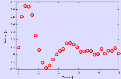
reset
set sample 30
set table 'bubble.dat'
p [0:5] sin(x*3.0)*exp(-x)+rand(0)/10.0
unset table

xs=-0.007
ys=0.002
unset key
set object 1 rect from screen 0,0 to screen 1,1 behind fillcolor rgb "#ddddff"
set border back
set xlabel 'Time [s]'
set ylabel 'Position [m]'
p [-0.1:5] 'bubble.dat' u 1:2 w p ps 3 pt 7 lc rgb "#ff0000", \
'' u ($1+xs):($2+ys) w p ps 2.6 pt 7 lc rgb "#ff2222", \
'' u ($1+xs):($2+ys) w p ps 2.2 pt 7 lc rgb "#ff4444", \
'' u ($1+xs):($2+ys) w p ps 1.8 pt 7 lc rgb "#ff6666", \
'' u ($1+xs):($2+ys) w p ps 1.4 pt 7 lc rgb "#ff8888", \
'' u ($1+xs):($2+ys) w p ps 1.0 pt 7 lc rgb "#ffaaaa", \
'' u ($1+xs):($2+ys) w p ps 0.6 pt 7 lc rgb "#ffcccc", \
'' u ($1+xs):($2+ys) w p ps 0.2 pt 7 lc rgb "#ffeeee"


The red parts are really irrelevant: the first one just produces some dummy data, we have seen this so many times that it is becoming boring. Then we define two variables (blue) 'xs' and 'ys', and draw a rectangle, just to have some background. In the last 8 lines we plot our data 8 times, each time in a different colour (the colour successively becomes whiter) and in different size (the points successively become smaller). At the same time, the centre of the circles is shifted by 'xs' and 'ys', so that we give the impression that the spheres are lit from the top left corner. By modifying these values, you can move your virtual light source.

The are only three caveats here: one is that since we apply a shift to the data points, we have got to make sure that our xrange and yrange supports the shifter data. This is why, while we have data in [0:5], our xrange is actually [-0.1:5]. The yrange does not require special attention in this case.

The second caveat is that it is perfect for a raster image, it will look quite nasty on a vector image. If you plan on printing the graph through postscript or pdf, you will have to define more levels for the transition from red to white. But the idea is the same, you will simply have more plots.

And third, when you define your 'xs' and 'ys', you have to make sure that the successive plots fall on the first one, otherwise your bubbles will have some funny shape.